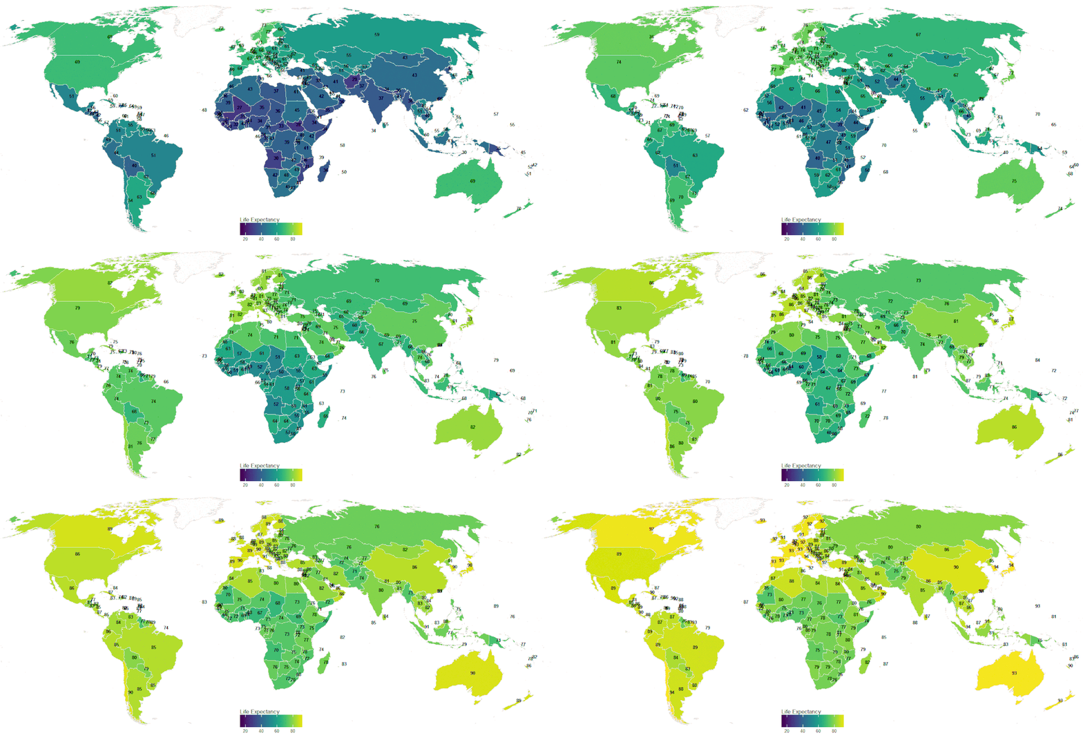
So, what of this map? Blogger Rafael H. M. Pereira created the pretty map below to find out the average life expectancy of each country in the world since 1950. He measured all the way up to 2015, and used handy data from the UN World Population Prospect 2015 to create his work, seen below.
With little change in countries such as the United States of America, as well as numerous African and Central Asian nations, it looks like those living in the likes of Australia and Western Europe (France at 93, Italy at 94, and the UK at 91, followed by Spain at 93!) are likely to live the longest.
What’s their secret? We can all speculate, but it’s fair to say that it’s all about the sun and that Mediterranean olive oil diet.
 Pumpkeen A Keen Way For Fun & Living


